Redesigning Val Pages
Today we’re revamping the design of standalone val pages. Something that we’ve learned from hours spent walking new folks through Val Town is that the individual val page could be disorienting and hard to visually parse.
A val is a rich object with a readme, comments, forks, versions, pull requests, references, and likes. We want to surface all of that information and ways to interact with a val, but we also want to keep vals feeling lightweight.
People are making amazing vals (some recent favorites), and we want them to shine. So we made a pretty big redesign to the val page:
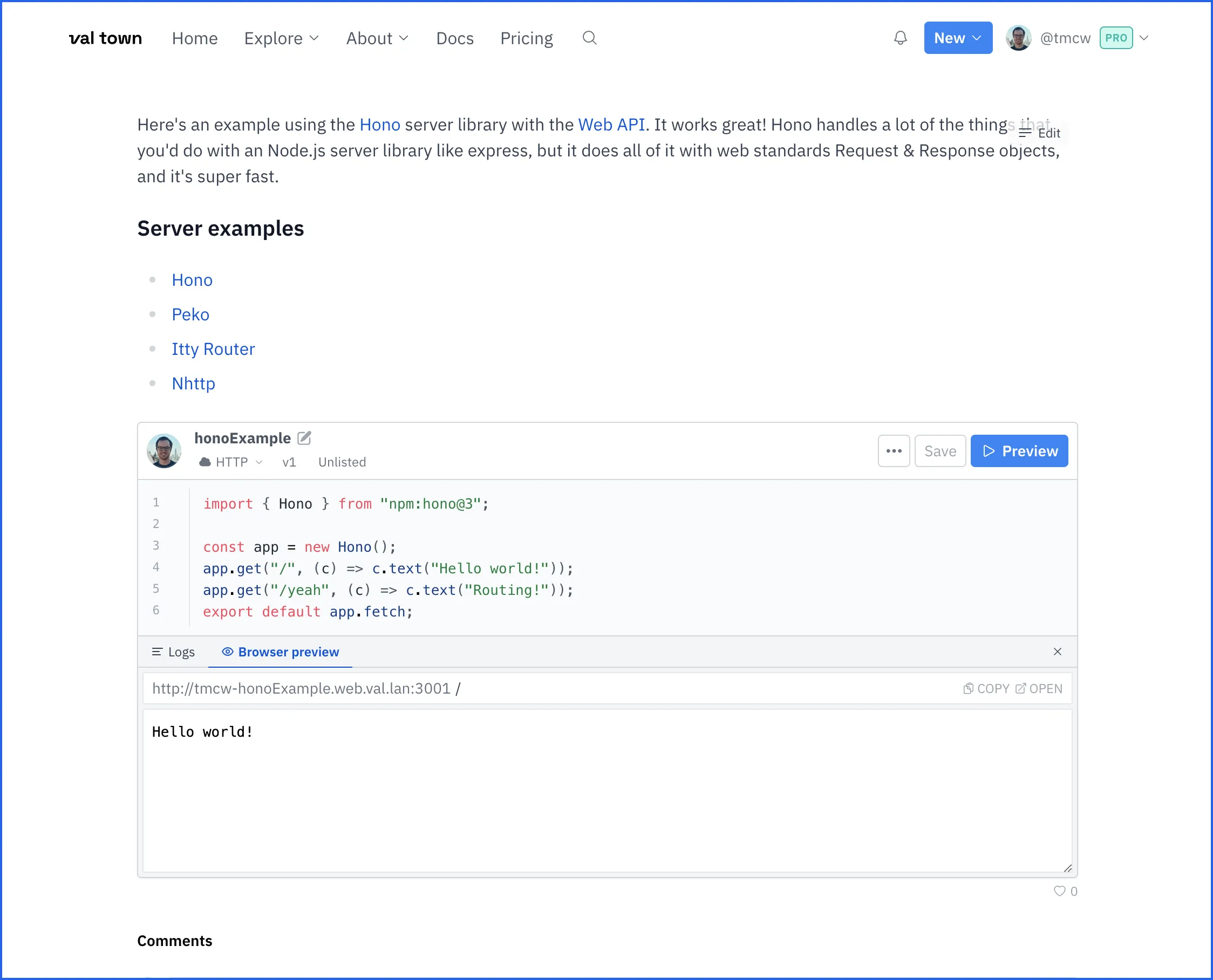
Val page before
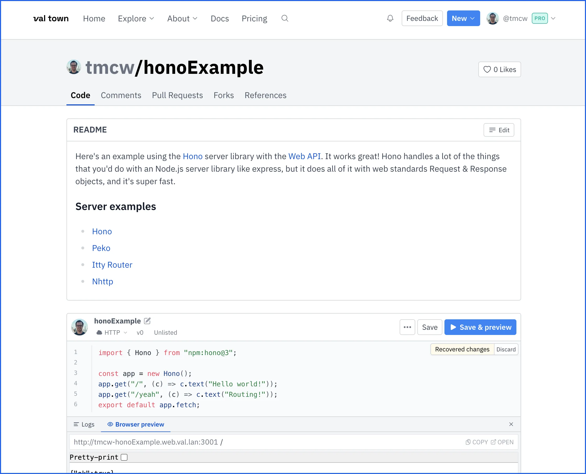
Val page after
In list and embed contexts, vals will look the same for now: the val editor was designed for those kinds of space-constrained situations. But now val pages make it much clearer what val you’re looking at, who made it, and what you can do with it. They also make the readme much more obviously a readme. The goal is understandability.
We hope this is a big improvement, particularly for folks new to Val Town, and it makes val pages a lot more readable and shareable. In traditional Val Town style, this improvement was made incrementally. There’s a lot more work to do to make vals more understandable and useful.
How do you think we did? We’d love to hear from you about this - join us in the Discord or tweet at us. Or if you really want to help us move forward the way we code socially, consider joining us at Val Town.
Edit this page